
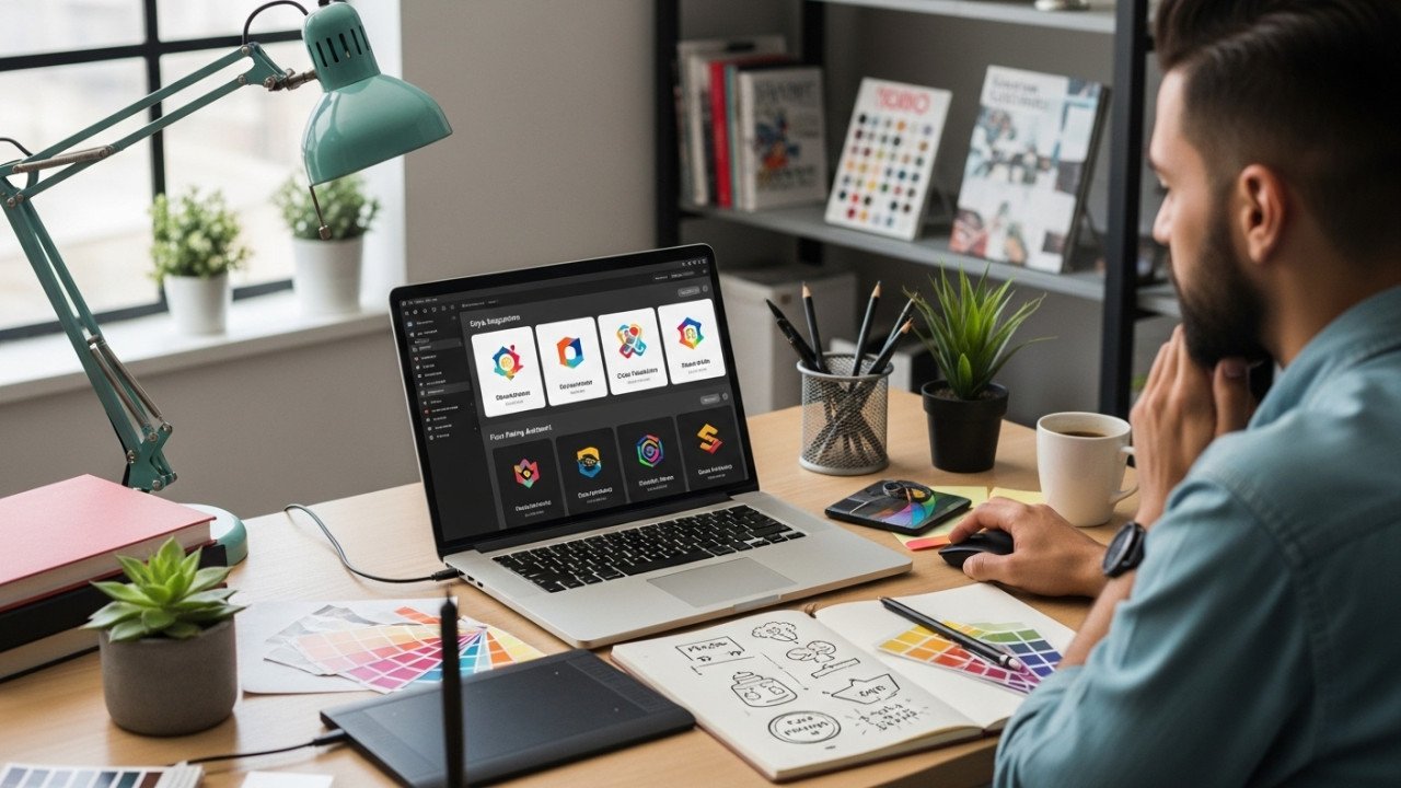
How to Use AI to Design Logos (Step-by-Step)
How to Use AI to Design Logos (Step-by-Step)
AI can speed up logo design dramatically, but it works best as a concept generator, not as the final designer. Good results usually come from a clear brand brief, specific prompts, multiple variations, and human refinement before you publish the final logo.
How AI helps
AI is useful for logo design because it can generate ideas fast, help you explore several directions quickly, and reduce the intimidation of starting from a blank page. The strongest workflows begin with brand identity, then move into style selection, prompt writing, variation testing, and refinement rather than expecting the first output to be perfect.
AI also performs better when you guide it with plain language and specific inputs such as logo type, mood, colors, and intended size or use case. In practice, that means AI is excellent for brainstorming wordmarks, badges, icons, mascots, and abstract concepts, while human judgment is still essential for making the final logo feel polished and professional.
Step-by-step process
1. Define the brand first
Before generating anything, define the business name, industry, audience, tone, and the message the logo should communicate. Brand-first inputs are a recurring part of AI logo workflows because the tool needs business context before it can suggest useful symbols, colors, or layouts.
Write a mini brief like this:
Brand name
Industry
Target audience
Brand personality, such as modern, playful, premium, bold, or minimal
Main values, such as trust, speed, creativity, elegance, or innovation
A concept-based prompt is often stronger than a purely visual prompt because it helps the logo express brand values, not just shapes.
2. Choose the logo direction
Pick the style and logo type before you prompt. AI tools respond better when you tell them whether you want a wordmark, badge, symbol, emblem, monogram, or abstract icon instead of simply asking for “a logo.”
A simple way to choose:
Use a wordmark if the brand name is strong and memorable.
Use an icon or symbol if you want a small, recognizable mark.
Use a badge or emblem for a classic, compact look.
Use an abstract mark if you want a modern or tech-oriented identity.
3. Write the first prompt clearly
Good AI logo prompts usually include the brand name, mark type, mood, palette, and a hint about scale or readability. One useful prompt pattern is: brand name + logo type + style + color direction + mood + size/readability goal.
Try this reusable template:
[Logo type] logo for “[Brand Name]”, [brand mood], [style], [color palette], clean shapes, readable at small size, simple background
Example:
Minimal wordmark logo for "NovaNest", modern and trustworthy, geometric sans-serif feel, blue and charcoal palette, clean spacing, readable at small size, white background
This works because it gives the AI a clear direction without overloading the prompt with conflicting ideas. Balancing detail with flexibility is one of the most consistent recommendations in AI logo prompting.
4. Generate several concepts
Do not expect the first result to be final. A better workflow is to generate two or three early directions, judge them as rough concepts, and use them to decide what direction feels right.
This stage is about finding a direction, not perfection. The best practice is to create a handful of options, compare them, and separate simple concepts from more complex ones to see which approach suits the brand better.
5. Shortlist and refine
Once you have a few promising results, shortlist the strongest one or two and begin refining them. Stronger AI logo workflows include customizing colors, layouts, icons, and other visual elements rather than accepting the first untouched output.
At this stage, ask practical questions:
Does the logo still work when small?
Is the icon too detailed?
Does the mood match the brand?
Does the color choice support the message?
Would this still look good in black and white?
Testing across different sizes and formats is especially important before you finalize anything.
6. Polish outside the generator
AI is best treated as the starting point, not the finish line. Professional results usually come from combining AI-generated concepts with manual refinement in design software, where you can clean spacing, simplify shapes, improve alignment, and prepare proper final assets.
That hybrid workflow is often the smartest approach: use AI for speed and ideation, then use human design judgment for polish and consistency.
7. Build the final logo set
After refining the design, prepare versions for real use: full logo, icon-only mark, monochrome version, light and dark versions, and small-size versions for favicon or app icon use. Testing the logo in multiple sizes and placements helps catch weak details before launch.
Finally, add the approved version to your brand kit,t so the logo stays consistent across your website, social profiles, documents, and product graphics.
Prompt examples
Below are ready-to-use AI logo prompts you can adapt for different niches.
Example 1: Coffee brand
Weak prompt
Logo for a coffee brand
Better prompt
Minimal badge logo for "Brew Lane", warm earthy palette, compact icon that reads at 24px, friendly sans-serif wordmark, modern artisan coffee brand, simple white background
Why it works: it specifies the mark type, mood, palette, and size goal instead of leaving the AI to guess everything. Those details are exactly the kind of inputs current AI logo guidance recommends.
Example 2: Tech startup
Prompt
Modern abstract logo for "CloudMint", futuristic but clean, geometric icon, blue and teal palette, trustworthy SaaS brand, balanced spacing, readable on website header and app icon
Expected result: a simple tech-style logo with a geometric symbol and a polished, startup-friendly look. Clear visual and brand cues usually produce better outputs than a vague “make it look modern” prompt.
Example 3: Beauty brand
Prompt
Elegant wordmark logo for "Luma Skin", luxury beauty brand, thin serif lettering, soft beige and gold palette, premium minimal style, balanced spacing, clean background
Expected result: a refined beauty-style logo focused on typography and a high-end feel. Prompts that name the mood and palette up front often help the AI stay closer to the intended brand personality.
Example 4: Gaming brand
Prompt
Bold mascot logo for "Pixel Fang", energetic gaming brand, sharp shapes, neon purple and electric blue accents, aggressive but readable, icon plus wordmark, dark background
Expected result: a high-energy logo direction with a stronger personality and more dramatic shapes. This kind of prompt works best when the mood and type of mark are both explicit.
Example 5: Law or consulting firm
Prompt
Professional monogram logo for "R&A Advisory", trustworthy and authoritative, dark navy and gray palette, clean lines, premium corporate style, strong readability at small size, white background
Expected result: a formal, conservative logo that feels more credible than flashy. Conceptual prompts built around trust, expertise, and authority are especially useful in professional-service branding.
How to refine weak results
Most bad AI logos are not unusable ideas; they are just under-directed concepts. The fastest fix is usually to improve the brief, simplify the prompt, and regenerate rather than piling on random extra instructions.
Here is a practical before-and-after pattern:
| Weak version | Stronger version |
|---|---|
| “Logo for a bakery” | “Minimal wordmark logo for ‘Honey Crumb’, warm cream and brown palette, cozy artisan bakery feel, rounded typography, simple icon, readable at small size” |
| “Tech logo” | “Abstract geometric logo for ‘VoltCore’, modern SaaS brand, blue and slate palette, futuristic but simple, balanced icon and wordmark, website-friendly” |
| “Luxury logo” | “Elegant serif logo for ‘Maison Verre’, black and gold palette, premium minimal fashion brand, refined spacing, clean monochrome-friendly layout” |
Use this refinement checklist:
Make the logo type explicit.
Add one clear mood word.
Add one focused palette.
Mention where it must work, such as the app icon, website header, or packaging.
Ask for readability at small sizes.
AI vs traditional logo design
AI logo design is faster for ideation, while traditional logo design is still stronger for strategic originality, precision, and final brand systems. The most effective approach for many businesses is not choosing one over the other, but combining both.
| Approach | Strength | Weakness |
|---|---|---|
| AI logo design | Fast idea generation, multiple directions in a short time, easier starting point for non-designers. | Often needs manual cleanup and should not be treated as the final step. |
| Traditional logo design | Better for deep refinement, originality, and polished final execution. | Slower and more demanding when you are still exploring ideas. |
| Hybrid workflow | Uses AI for concepting and design software for polish, which combines speed with professional control. | Requires some design judgment to choose and refine the best concept. |
A simple rule works well:
Use AI when you need direction fast.
Use traditional refinement when the logo will represent a real brand long term.
Use both when you want the best balance of speed and quality.
Professional tips
Keep your prompts simple, specific, and intentional. Plain language often works better than overly clever phrasing, and it helps to mention the type of mark, the emotional tone, and the size or placement where the logo must perform well.
Do not settle for the first decent result. Generate several options, compare them carefully, and test the winner across website headers, profile images, packaging, and small icons before calling it finished.
Most importantly, remember that AI is best used to accelerate exploration, not replace brand thinking. Start with AI, refine with judgment, and turn the strongest direction into a clean final identity that feels intentional and professional.
Try this workflow on Imagartai: generate 5 to 10 logo directions, keep the 2 strongest, refine the best one, and then test it at small and large sizes before publishing it anywhere.


Comments (0)
No comments found